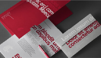
Colors
The colors we choose and how we combine those colors with other visual elements create a unique and compelling expression of the WSU brand. Students, staff, alumni, faculty, and other WSU audiences recognize crimson and gray immediately, but supplementary colors allow groups within the WSU family to build their own unique identity. Consistent use of these colors will contribute to the cohesive and harmonious look of the Washington State University brand identity across all relevant media.
Core Colors
Crimson, gray, and white are the foundation of the WSU color palette. They serve as the brand’s primary colors for print, electronic, and environmental applications.
PMS — 201 C
RGB — 166 15 45
CMYK — 0 100 63 31
HEX — #A60F2D
Crimson
PMS — 7540 C
RGB — 77 77 77
CMYK — 34 24 24 64
Black — 77%
HEX — #4D4D4D
Gray
Secondary Colors
More grays. Brighter crimson. More options. These secondary colors can be used to add a different tone to a design while remaining true to the university’s official crimson and gray brand identity. However, these colors should not be used as part of the WSU logo.
PMS — 186 C
RGB — 202 18 55
CMYK — 14 100 82 4
HEX — #CA1237
Red
PMS — Neutral Black
RGB — 0 0 0
CMYK — 0 0 0 100
HEX — #000000
Black
RGB — 255 255 255
CMYK — 0 0 0 0
HEX — #FFFFFF
White
Black 80%
Black 70%
Black 60%
Black 50%
Black 40%
Black 30%
Accent Colors
While WSU’s official crimson and gray should be the go-to colors for most needs, there are times when variety adds value. To broaden the university’s color palette and expand opportunities for impactful design, accent colors are available for use. For those instances where a greater range of color is called for, WSU has carefully curated a supplemental palette of accent colors. Used strategically and sparingly, they can add visual interest, distinguish elements in a sequence, or differentiate parts of a whole.
PMS — 165 C
RGB — 225 103 39
CMYK — 0 68 96 0
HEX — #FF6727
Autumn
PMS — 3945 C
RGB — 243 231 0
CMYK — 2 0 98 0
HEX — #F3E700
Goldfinch
PMS — 2290 C
RGB — 170 220 36
CMYK — 34 0 95 0
HEX — #AADC24
Vineyard
PMS — 2985 C
RGB — 91 195 245
CMYK — 58 0 0 0
HEX — #5BC3F5
Pacific Sky
PMS — 648 C
RGB — 0 45 97
CMYK — 100 69 0 56
HEX — #002D61
Midnight
Use an accent color in limited ways to support specific communication objectives.
Do not use an accent color in a dominant way, implying that it is an official university color.
Do not pair an accent color with crimson in a way that implies it has equal or secondary status as a university color.
Using Ratios
As you tackle special branding needs, please adhere to the ratios listed below. The palette should be 70% crimson and/or gray, 20% a secondary color, and 10% or less devoted to the accent color palette.
Guidance
DO
Do use crimson and gray from our primary palette.
DO
Do apply the palette in accordance with the correct percentages.

DO
Do use variations of gray that fit the use and intent of the piece and maximize legibility.
DON’T
Do NOT use accent colors as primary or secondary colors.

DON’T
Do NOT use colors that are associated with other regional universities.

DON’T
Do NOT screen back crimson or use it as a gradient with gray.